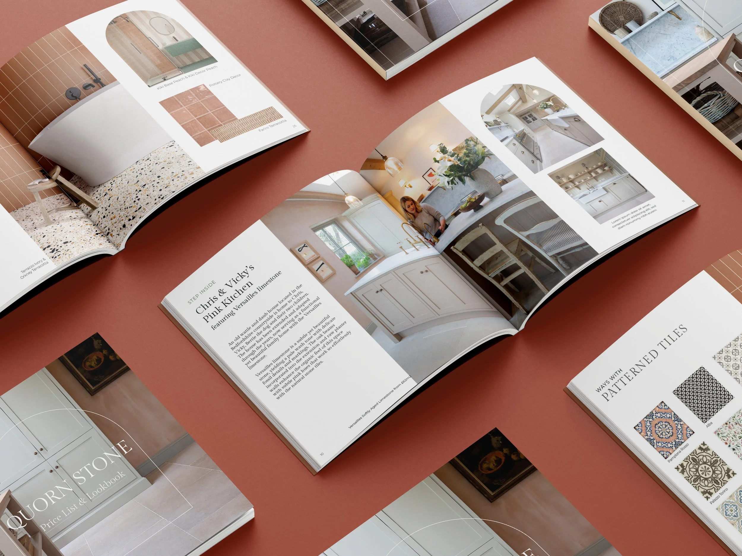
Quorn Stone
Rebrand for a family owned luxury tile and stone merchant who wanted a heritage look and feel with nods to modern design.
The updated typeface is reminiscent of stone carving and gives an elevated heritage feel. While using natural stone and marble colours fits with their natural offerings.
The colours, textures and patterns inspired by the tiles and stones are carried on throughout the website and brochure and add a touch of softness to the digital assets. Slightly imperfect shapes and curves also add to the authentic nature.
During the initial stages of development they pulled out words like; heritage, British, trustworthy, family-run, high end. These became the basis of the brand refresh and are reflected throughout.